Friday, 11 May 2012
Friday, 9 March 2012
Evaluating my Final Newspaper:
Likes and dislikes:
After having finished my Newspaper front cover and inside page, I have been analysing the areas that I like and dislike. The main element that I particularly like, that I feel makes my front page look like a newspaper is use of column inches. By splitting my text into four columns that were an inch wide, made my newspaper instantly appear professional. Another convention that I particularly like was the Identity tag. I liked this, because it was bold and stood out from the page. This was important because it was this convention that I needed my audience to remember. The mixture of both the red and black colours worked well together for this, and also helped to capture my attention.
An area that I disliked about this Newspaper was the use of imaging. The reason for this is because I felt that the image was too blurry and pixelated. This may have been down to the digital camera that I used when taking the photograph. If i were to do this again, I would use a canon camera to create a better quality image.
FINAL NEWSPAPER DESIGN:
After having incorporated all of these elements, this is what my final design of my Newspaper and inside page looks like:
Thursday, 9 February 2012
INCORPORATING IMPROVEMENTS:
We decided upon changing the Newspapers Font because we felt that we needed a mast head that could stand out on the page- but also one that was memorable for our audiences. The colours red and black have both been used in our Mastheads, because it follows the theme of our Newspaper, and so it makes good links.
Changes to the teaser image:
Before:
My original image seemed to pixelated, as it needed to be stretched to fit onto my newspaper page.
After:
I now have taken another image of another Local store, which is less pixelated and will allow me to place it onto my Newspaper without the need for stretching.
Thursday, 26 January 2012
NEWSPAPER IMPROVEMENTS:
After having annotated my Newspaper and scanned it through to the computer, I will be able to refer to this and use it as a task sheet - to show me which improvements I will need to make to my Final Newspaper.
Thursday, 5 January 2012
Photography.
This is a photograph I have taken in the City of Cambridge. I have decided to use this as a potential photo I could incorporate into my Newspaper - as my main Newspaper headline is 'Five Locals rescued from house fire'. The reason I decided to use this one in particular, was because it was an old building which had dark smoky features. It was this that instinctively reminded me of something which may have been involved in a fire.
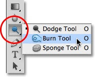
In order for me to enhance the effect of a building being caught in a fire, I decided to use photoshop, where the main tool I used was known as the burn tool.Below, I have my initial photograph:
When photoshopping this image, my first task was to crop it, so that the people at the bottom were not to be seen. I then decided upon cropping the image from the left towards the centre right of the page - so that I was left with what appeared to be one building.
My last task was using the burn tool. Here, I particularly focused upon the more enclosed areas, as these ares are what are going to need to be the darkest - in order for it to look as realistic as possible.
My complete photograph after being edited is shown below:
Photograph after editing:
 I particularly like this photo because the burn tool has worked well and created a realistic outcome - one that I could incorporate in my Newspaper.
Using a close up shot of the building, really portrayed the after effect of the house having been caught on fire. The main reason I decided to use this particular shot, was to exaggerate its burnt features, and really bring out the contrasts of the dullest areas, next to the lighter areas that the fire had not reached.

This photo I have taken on the left portrays the image linking to my "New park plans unveiled" storyline. I took this photograph of a near - by area and used a long establishing shot - to clearly identify it's setting and surroundings.
I feel that this is a good photograph to use in my Newspaper because it is well presented and is clear to look at.
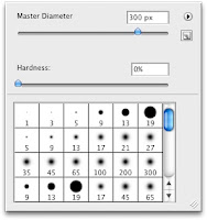
 On the right, I have an image of the brightness tool, which allows me to determine the brightness and darkness of the shadows on Photoshop. The Master Diameter is the size of the tool that I will be using for the areas that I will be altering. This all depends upon the size of the area that I will be altering. In this case, the area that I wanted to make look lighter, was the majority of the photograph, up until the bottom right of the page - where the shadows began creeping in.
This photo I have taken links to my "New park plans unveiled" story line. I decided to take an image of a shop sign in Cambridge to portray the shops company.
However, the use of pixelation lowers the appearance - as it makes it harder to see the photograph and harder to read the text.
Photography for the inside page:
 I particularly like this photo because the burn tool has worked well and created a realistic outcome - one that I could incorporate in my Newspaper.
Using a close up shot of the building, really portrayed the after effect of the house having been caught on fire. The main reason I decided to use this particular shot, was to exaggerate its burnt features, and really bring out the contrasts of the dullest areas, next to the lighter areas that the fire had not reached.

This photo I have taken on the left portrays the image linking to my "New park plans unveiled" storyline. I took this photograph of a near - by area and used a long establishing shot - to clearly identify it's setting and surroundings.
I feel that this is a good photograph to use in my Newspaper because it is well presented and is clear to look at.
 On the right, I have an image of the brightness tool, which allows me to determine the brightness and darkness of the shadows on Photoshop. The Master Diameter is the size of the tool that I will be using for the areas that I will be altering. This all depends upon the size of the area that I will be altering. In this case, the area that I wanted to make look lighter, was the majority of the photograph, up until the bottom right of the page - where the shadows began creeping in.
This photo I have taken links to my "New park plans unveiled" story line. I decided to take an image of a shop sign in Cambridge to portray the shops company.
However, the use of pixelation lowers the appearance - as it makes it harder to see the photograph and harder to read the text.
Photography for the inside page:
Subscribe to:
Comments (Atom)


