After having annotated my Newspaper and scanned it through to the computer, I will be able to refer to this and use it as a task sheet - to show me which improvements I will need to make to my Final Newspaper.
Thursday, 26 January 2012
Thursday, 5 January 2012
Photography.
This is a photograph I have taken in the City of Cambridge. I have decided to use this as a potential photo I could incorporate into my Newspaper - as my main Newspaper headline is 'Five Locals rescued from house fire'. The reason I decided to use this one in particular, was because it was an old building which had dark smoky features. It was this that instinctively reminded me of something which may have been involved in a fire.
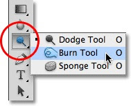
In order for me to enhance the effect of a building being caught in a fire, I decided to use photoshop, where the main tool I used was known as the burn tool.Below, I have my initial photograph:
When photoshopping this image, my first task was to crop it, so that the people at the bottom were not to be seen. I then decided upon cropping the image from the left towards the centre right of the page - so that I was left with what appeared to be one building.
My last task was using the burn tool. Here, I particularly focused upon the more enclosed areas, as these ares are what are going to need to be the darkest - in order for it to look as realistic as possible.
My complete photograph after being edited is shown below:
Photograph after editing:
 I particularly like this photo because the burn tool has worked well and created a realistic outcome - one that I could incorporate in my Newspaper.
Using a close up shot of the building, really portrayed the after effect of the house having been caught on fire. The main reason I decided to use this particular shot, was to exaggerate its burnt features, and really bring out the contrasts of the dullest areas, next to the lighter areas that the fire had not reached.

This photo I have taken on the left portrays the image linking to my "New park plans unveiled" storyline. I took this photograph of a near - by area and used a long establishing shot - to clearly identify it's setting and surroundings.
I feel that this is a good photograph to use in my Newspaper because it is well presented and is clear to look at.
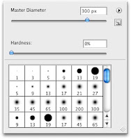
 On the right, I have an image of the brightness tool, which allows me to determine the brightness and darkness of the shadows on Photoshop. The Master Diameter is the size of the tool that I will be using for the areas that I will be altering. This all depends upon the size of the area that I will be altering. In this case, the area that I wanted to make look lighter, was the majority of the photograph, up until the bottom right of the page - where the shadows began creeping in.
This photo I have taken links to my "New park plans unveiled" story line. I decided to take an image of a shop sign in Cambridge to portray the shops company.
However, the use of pixelation lowers the appearance - as it makes it harder to see the photograph and harder to read the text.
Photography for the inside page:
 I particularly like this photo because the burn tool has worked well and created a realistic outcome - one that I could incorporate in my Newspaper.
Using a close up shot of the building, really portrayed the after effect of the house having been caught on fire. The main reason I decided to use this particular shot, was to exaggerate its burnt features, and really bring out the contrasts of the dullest areas, next to the lighter areas that the fire had not reached.

This photo I have taken on the left portrays the image linking to my "New park plans unveiled" storyline. I took this photograph of a near - by area and used a long establishing shot - to clearly identify it's setting and surroundings.
I feel that this is a good photograph to use in my Newspaper because it is well presented and is clear to look at.
 On the right, I have an image of the brightness tool, which allows me to determine the brightness and darkness of the shadows on Photoshop. The Master Diameter is the size of the tool that I will be using for the areas that I will be altering. This all depends upon the size of the area that I will be altering. In this case, the area that I wanted to make look lighter, was the majority of the photograph, up until the bottom right of the page - where the shadows began creeping in.
This photo I have taken links to my "New park plans unveiled" story line. I decided to take an image of a shop sign in Cambridge to portray the shops company.
However, the use of pixelation lowers the appearance - as it makes it harder to see the photograph and harder to read the text.
Photography for the inside page:
Wednesday, 14 December 2011
STARTING MY NEWSPAPER OUTCOME:
Thursday, 10 November 2011
Conventions to be placed into the Newspaper:
Front Cover Page:
Web Address: www.HaverhillWeeklyGazette.co.ukDate: Friday 16th December 2011
Newspaper Name: Haverhill Weekly Gazette
Price: 35p
Kicker1: 'Local store set to close'
Kicker Image 1: Shop sign.
Kicker 2: 'New park plans unveiled'
Kicker image 2: Land area.
Main image: Remains of burnt building.
Main article: '5 locals rescued from house fire'
Advertisements: Local homes for sale.
What's inside:
Colour palettes: Red, Grey, Black.
Colour of fonts: Black.
Type of font: Masthead = Bell MT
Article titles = Franklin Gothic Book
Inside Page:
Main article: Local Charity receives mystery donation of £2,000.00
Advertisements: Restaurant prices.
Main images: Group of people holding the large cheque.
Other image: Rescued dog.
Creating the front page and inside page of the Haverhill Gazette:
From having completed all of my research, I will now be applying this to create my 'Haverhill Gazette' Newspaper front page and inside page.
To do this, I will be using the software 'InDesign' - where this allows me to create the templates and design of the Newspaper pages.
From using this software I hope to gain experience when dealing with different convention types - where fonts, language, colour and shape all need to be considered carefully.
I will also be experimenting with Photoshop elements, so that I can edit my photographs to a standard that blends well with my Newspaper and its theme.
Thursday, 6 October 2011
Colour palette ideas:
Below I have looked into research for different colour pallets, and tested some to see which work better than others:
When creating this colour palette, we agreed that using bright colours was not a good idea because they made a Newspaper look unprofessional and less serious. We also took into account the main target audiences, and what we felt they may like using the survey monkey questionnaires we created. Throughout the list, we have kept two main colours or shades - black and grey. Where we realised that these were the two that were always to be seen on a newspaper.
As a group, we felt as though we wanted to apply a colour scheme that would be unique to the Newspaper. We also had to think about colours which can suit both sexes and also target our Demographic target audiences.
The first 3 colour palette idea, we felt was too original, and maybe didn't portray enough colour, as this could potentially make the Newspaper seem dull.
The second colour list, we quite liked - where the colours are unisex, and the duck - egg blue added brightness in contrast to the two other colours.
The third colour palette idea we thought was to feminine, because the purple is a colour that is mainly suited for females. And so we decided not to use this palette.
The fourth colour palette ideas was joint no decision. As a group we all disliked the brightness and richness of the green, especially when it was situated next to the two other colours.
The fifth colour palette, we all particularly liked - where we all realised that it worked well with the other 2 colours, and that it was a unisex colour. We also liked that the red can be enhanced to create a brighter colour, or even to create a darkened colour.
The last colour palette idea, was an ideal colour scheme. Where the colours worked well together, and the blue brightened up the page. However as a group we felt that this scheme was too original, and has been used on several other existing newspapers.
Over-all we decided upon the colour palette consisting of black, grey and red. This decision hopefully will benefit our newspaper, creating a professional look whilst also brightening the page.
Final Newspaper Layout design:

On the above left, I have the front cover Newspaper Layout Design which I hope to use for my final piece.
This layout uses all of the typical codes and conventions needed for a successful newspaper.
There is an even amount of space for images and text - which is what was proven best in my survey monkey.
The use of inside teasers is a good element to add to a Local Newspaper, as this urges the readers to read on, and also gives a hint as to what may be expected to find inside.
As for the use of advertisements, we decided upon placing these at the bottom of the Newspaper page - acting as a footer, so that it is separated from the story lines and images. As for the size of the advertisement section, we felt that it shouldn't take up too much of the page, as it is not seen as the most important area.
On the above right, I also have decided upon the inside page of the Newspaper Layout template that we will be using. We have chosen this particular one because there is a fair amount of text and images that can be incorporated into it, where earlier on we gathered results from our Survey Monkey where the people we surveyed said they preferred not too much text but also some images.

Using indesign, I have created the final templates of the front page and also the inside page of the Newspaper aimed for my target audience aged 19-30.
Subscribe to:
Posts (Atom)


